
By Virginia Kettles
In 2013, the New York Times bestselling author Deborah Copaken wrote an essay about her experiences watching her books be “girlified” for publishing.
In the essay, Copaken spoke about the publication of her first book, a memoir about her experiences as a war photographer. After purchasing the rights, Random House changed the title of her manuscript to Shutterbabe and designed a cover involving a naked cartoon torso against a pink background with a camera covering the genitalia. It took a long fight on Copaken’s side to convince the publishers to rethink the design.
Such is the case for gender-specific advertising, and, as the saying goes, it doesn’t hurt that “sex sells.”
While there is little data readily available on the exact trends of this phenomenon, gender-specific advertising in regards to book covers has become increasingly common.
Walking into any local bookstore, customers can often find two kinds of books: ones with dark colors, thick, heavy fonts, and simple images, and others with lighter, muted colors, cursive fonts, and images of attractive, usually Caucasian, women. Some, as if by instinct, will unconsciously make assumptions on what kind of person wrote the book and, as a result, who the book is catered towards.
What’s wrong with this? Perhaps nothing. After all, a marketing tactic like that must be successful if it is practiced so freely. Consumers are perfectly able to purchase what they like. If that means we humans are slaves to our unconscious preferences that parallel the stereotypes associated with our gender, then so be it.
But this comes at a cost.
Johnson, a successful young adult author, wrote an essay about the uncomfortable attribution of gender and quality when it came to discussing books. According to her, books written by women, and especially books written by women ABOUT women, are often pegged as being of a lower quality.
“When I hear people talk about ‘trashy’ books, 95% of the time, they are talking about books written by women. When I see or hear the terms ‘light,’ ‘fluffy,’ ‘breezy,’ or ‘beach read’…95% of the time, they are talking about books written by women.”
Thus, I wondered. If femininity is not taken seriously in the literary world, what does that say about the book covers that employ the feminine theme so heavily? If a person is presented with a feminine-looking cover, will they see the book as being of a lower quality? Would they be interested in reading the book? Would they think the book could win an award?
As a senior in high school, I tested just that.
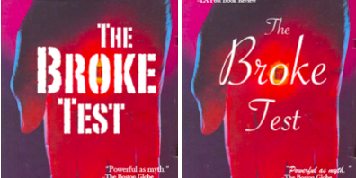
I created 3 pairs of fake book covers, where one was garnered towards women, and the other towards men, based on the author’s gender, the font, and the image in the background. I attached the different covers to surveys, in which I asked questions about what the book’s quality seemed to be, and whether the book was likely to win a literary award. I then distributed the survey to about 200 students and a handful of teachers at my high school.

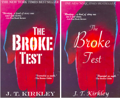

The results were fascinating. While the gender of the author for the book Outsider made little difference when it came to the perceived quality of the book, the fonts and images in the other books elicited substantially different reactions. Participants saw the desk-and-skull background for The Study Side as being of a higher quality, and the bold-faced fonts of The Broke Test even more so. In comparison, the image of the woman-smelling-flowers background, or the frilly fonts, did not impress the participants.
It seems there is still a lot to be said about how people view femininity in terms of respect and reputability in the literary world.